All American Inc. Wireframe
A beginner's journey into wireframing and user experience design using Figma for a real-world business site. This article walks through my first experience designing a complete website wireframe from scratch.
Project Overview
This wireframe project was intended to explore the core principles of information architecture: organizing content clearly, guiding user flow, and improving usability without actually building a working website. Our class was split into groups of four, each responsible for planning and presenting a functional site structure for an existing business.
Unfortunately, group dynamics became an issue early on. Most team members failed to show up to meetings or contribute meaningfully. In the end, I collaborated with just one other student for the final presentation, but I took full ownership of the design work. I created each page of the wireframe, from the homepage and service listings to the contact form and quote request interface.
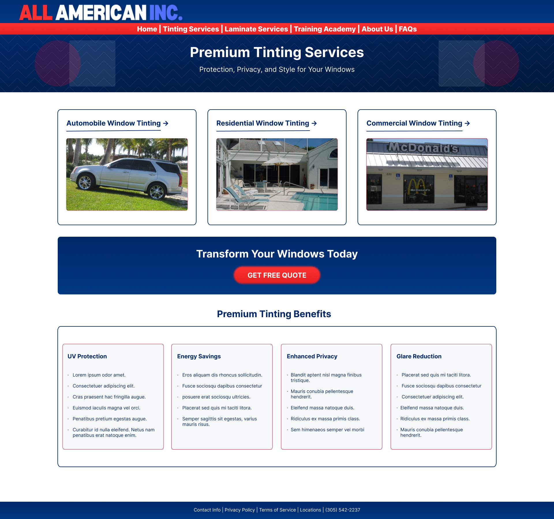
The goal was to create a navigable prototype that improved upon the original site by focusing on content clarity, visual hierarchy, and user trust. I'll later embed the interactive Figma prototype as a hero banner and include a visual comparison between the old site and my design.
Learning to Use Figma (and Designing with Purpose)
This was my first time using Figma, and I was both intimidated and excited. Figma is a collaborative design tool often used in the professional world for prototyping websites, apps, and interfaces. It works entirely in the browser, making it great for design teams, though in my case, I was essentially flying solo.
At first, I struggled with aligning elements, using grids, and getting a feel for spacing. But once I got the hang of frames, components, and text styles, I began approaching the design more strategically. I didn't just want the wireframe to "look nice"; I wanted it to feel easy to use and reflective of the brand.
Some of the intentional choices I made included:
- Simple top navigation bar that always included a call-to-action (like "Get a Free Quote")
- Clear service tiles that explained what each package offered with optional pricing tiers
- Reorganized contact and quote sections, making sure a user would never feel lost or unsure how to reach out
Key Features & Design Thinking
Although this wasn't a coded website, the design still needed to think like one. Every decision I made aimed to enhance clarity and conversion.
Here are a few highlights:
Homepage Flow
Users land on a hero image with a quick summary of what the business does, followed by scrollable sections highlighting services, testimonials, and a visual before/after.
Quote Form
I designed this to appear above the fold on mobile, making it easy to access without unnecessary scrolling.
Service Comparison Layout
I created a simple comparison block that lists out features across different packages, a design trick borrowed from popular SaaS websites to help customers make faster decisions.
FAQ Page
Instead of long text blocks, I used collapsible accordion components (even though they're only visual in the wireframe) to show how interaction could improve readability.
Challenges & Reflections
The biggest challenge wasn't the software, it was managing the workload alone.
Group Project Dynamics
Group projects often test your communication skills, but in this case, they also tested my initiative. After a couple of no-show meetings, I realized that waiting for others would hold me back, so I took the lead. I designed, revised, and documented every part of the wireframe. The only real collaboration happened during the final presentation.
Balancing Detail vs. Simplicity
Another challenge was finding the right balance between structure and presentation. While wireframes are typically grayscale and focused purely on layout, I chose to incorporate branding colors and subtle visual styling to make the wireframe feel more true to life. This added a layer of polish without losing sight of the project's purpose. Even with the added color, I kept my attention on content hierarchy and spacing, elements that quietly shape how usable and intuitive a site really feels.
First-Time Tool Learning
Learning Figma while simultaneously trying to create a professional-quality wireframe was like learning to drive while navigating to a new destination. The tool itself became less of a barrier as I progressed, but the initial learning curve definitely slowed down my early iterations.
"After a couple of no-show meetings, I realized that waiting for others would hold me back, so I took the lead. Sometimes the biggest challenge in group work is learning when to work independently."
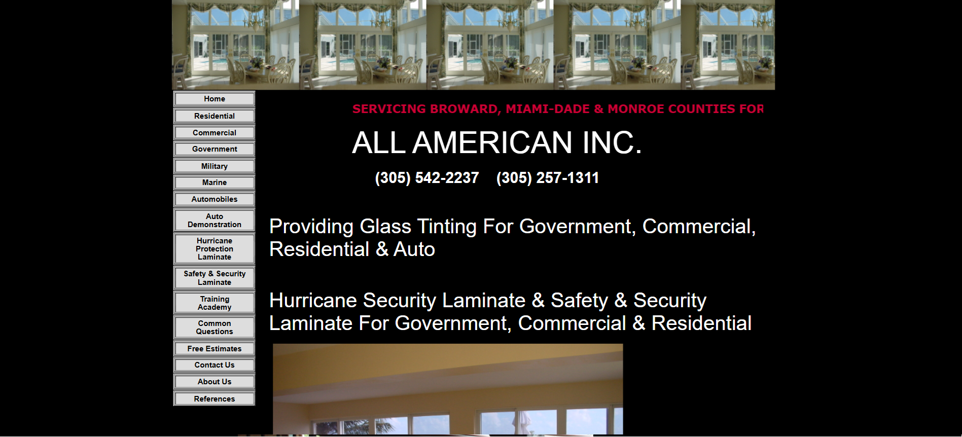
Visual Showcase (Before & After)
This section includes side-by-side comparisons of the original website and my redesigned wireframe. While the original had outdated styling and cluttered navigation, my version introduced clarity, responsiveness, and a more professional feel, especially on mobile layouts.
Lessons Learned
UX Design is About Empathy
You're not designing for yourself, you're designing for the person who visits the site at 10 p.m. looking for a quote. Every design decision should make their experience easier, not showcase your creativity at the expense of usability.
Structure Comes Before Style
Wireframes don't need to be pretty to be powerful. Clean layout and logical flow matter more than colors and fonts at this stage. This project taught me to focus on the foundation before worrying about the decoration.
Solo Work Can Be Empowering
Although it was meant to be a team effort, taking full control helped me understand every part of the process more deeply. I learned that sometimes working independently can be more productive than waiting for consensus.
Tool Mastery Comes Through Practice
Figma seemed overwhelming at first, but by the end of the project, I was comfortable with frames, components, constraints, and interactive prototyping. The best way to learn design tools is through real projects with actual constraints and deadlines.
"This project taught me that great UX design isn't about making something look good, it's about making something work intuitively for real people with real needs."
Future Improvements
While this project was only meant to stop at the wireframe, it left me wanting to build the full site. If I ever revisit this project, I'd consider:
Development & Implementation
- Turning it into a coded prototype, possibly using HTML/CSS and a JavaScript framework
- Adding animations or transitions to simulate interactions more realistically
- Implementing responsive breakpoints to ensure the design works across all device sizes
User Testing & Validation
- Testing the design with real users to collect feedback on pain points or confusion
- A/B testing different layout approaches to see which converts better
- Usability studies to identify areas where users get stuck or confused
Enhanced Functionality
- Integration with scheduling systems for automatic quote booking
- Before/after photo galleries with filtering and search capabilities
- Customer testimonial system with verified reviews
- Mobile-first quote calculator with instant pricing estimates
The wireframing process gave me a solid foundation to build upon, and I'm excited to potentially turn this concept into a fully functional website that could genuinely help a local business succeed online.